New Business Interiors web design
It gives me great pleasure to offer a design for your new website, please note that this is only an 'image' of your new web page and not an html design. Consequently a number of differences shoudl be observed:
  • The page will not resize itself subject to to the viewers screen resolution. With the final design the page will fill the users screen irrespective of screen size.
  • Roll over effects will not effect although please note:
    • You mentioned that you wanted javascript drop down menus. We would be happy to do these but please note it is not recommended. The script does not work on all browsers, can cause issues for some people with their pc's set up and is not recognised by search engines.
  • I have not seen your brochure so have made my own specimen idea
  • Have included a call back mechanism, thsi will be driven by Javascript so will show whether the customer will get an instant answer or 'next business day'
  • Download times and rendering will not be actual as the page is not downloading many html elemenst but one big, fat image!
  • Obviously you may want to change elements and text shwon, they are just examples.
  • Our designs never completely fill the page, allowing new elements to be incorpoarted following the websites success.
Developing your ideas (Please note design order has been reversed) :
Design Six

Following from our discussion on Friday 14th September and your email (dated 4th September with attached case study) I have redesigned the site to be more sympathetic to your printed literature. My only concern is that these colours will not come over very well on many monitors - they are a bit bland with your logon not really punching its way out of the screen - but this maybe your intention? I have also detailed the image - currently as static but envisage this to be a flash movie which scrolls through examples.


View
Design Five

Following our discussion on Tuesday 28th I have taken your observations and offer this redraft. With the logo we use it to break up the page more and not have everything segmentted and try changing the images away from stock library images. We will also try these with your before after images when received


View
Design Four

Finally we add a linear gradient to the background...


View
Design Three

We carry on the development of design two and more accurately reflect your brochure by removing the background effect completely


View
 
Design Two

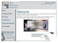
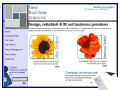
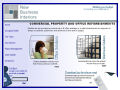
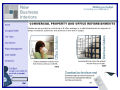
Based off our your comments from design one we had found some elements you liked and some you disliked ( I like the latter as it least shows you care about the brand and web redevelopment!). Consequently I took the main points and designed this,

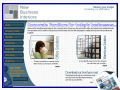
Having moved the sweep your website resembles your brochure more but becomes more blocky, I have toned down the left column and removed the button effect - you must ask yourself if you feel that these will be obvious as links? Personally I like stronger colours so they have a more powerful impact on the viewer, but you may like the toned down effect for your business?


View
Design One
Based off our first discussion this design was offered to you as a result of the emails and existing website comments:

View